
I’m comin’ at this from a Comparative Insight angle — lookin’ at how volumetric packing and density optimization from freight packaging can teach us tighter, greener ways to design station wayfinding. Folks who spec public transport signage already know tight layouts matter; this just borrows packing logic and applies it to human flow, sightlines, and material use. The idea: treat signs like modular freight — stack what you need, strip what you don’t, and let legibility win.
Why density thinking matters for stations
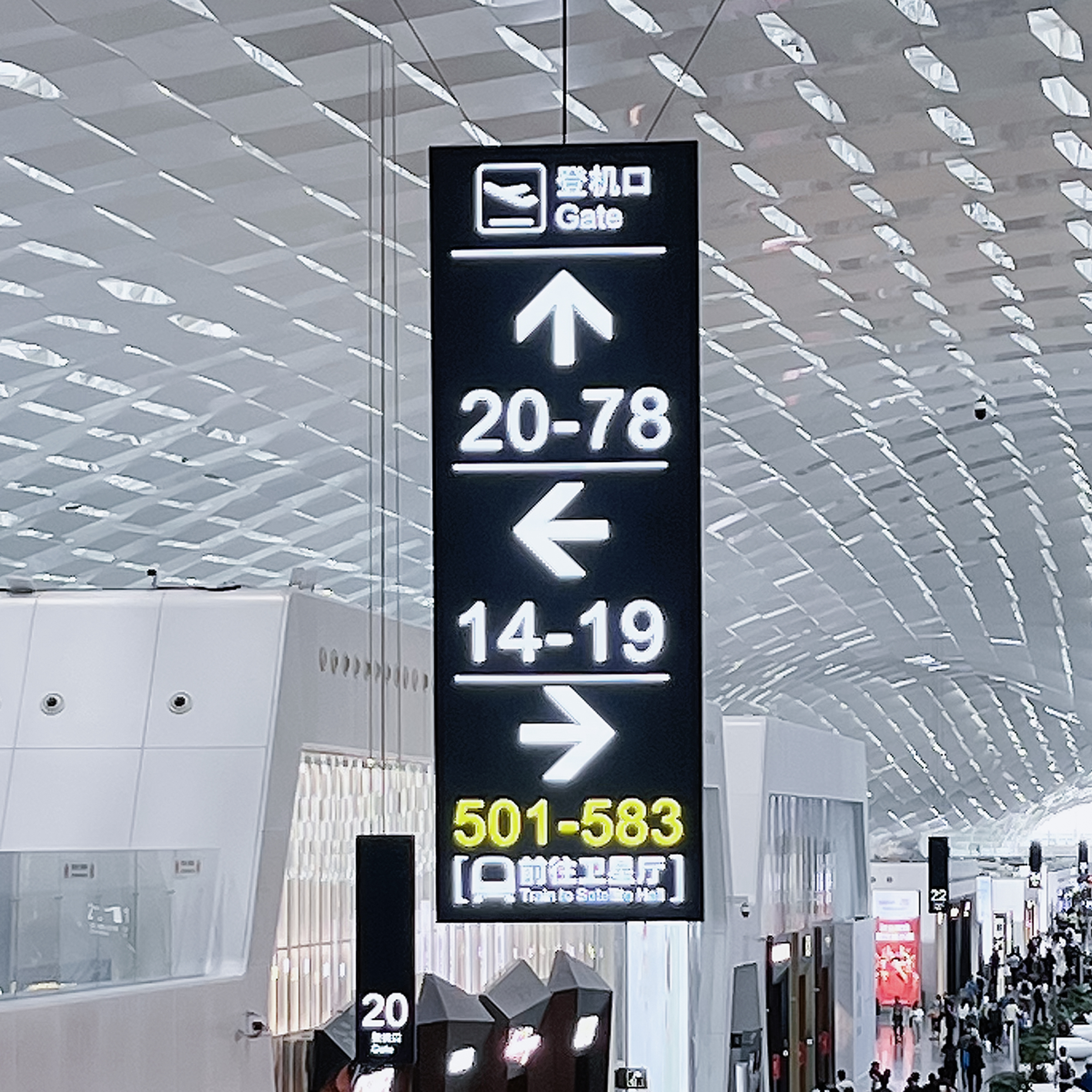
Dense stations like Tokyo’s Shinjuku — one of the world’s busiest hubs — got zero room for sloppy signs. Wayfinding that’s fat on paint and thin on clarity slows people down and wastes material. When you optimize for volumetric efficiency, you cut sign clutter, drop material waste, and improve sightlines. That’s sustainability that actually shows up in daily operations, not just on a policy sheet.
Comparing two approaches: sprawling vs. density-first
Sprawling: lots of big overhead boards, redundant posts, heavy fixtures. It looks comprehensive at first, but it confuses sightlines and duplicates materials. Density-first: compact floor graphics, aligned sight channels, selective overheads where needed. That second approach leans on legibility and tactile paving to guide folks without scream-sign overkill. Real talk — fewer, smarter elements beat a wall of information every time.
Practical tactics stolen from freight packaging
Freight packers squeeze volume, standardize modules, and use the minimal strong material. Apply that here: standardize panel sizes so modules swap fast. Place floor markers in a grid that respects human stride lengths and sight cones. Use high-contrast glyphs and retroreflective accents only where visibility drops. Keep tactile paving for mandatory thresholds and boarding edges; don’t overuse it or it loses meaning.
Design trade-offs and performance metrics
Measure three things: time-to-decision (how fast people pick a route), error-rate (wrong turns per thousand), and material footprint (surface area of signage per square meter of concourse). These give you concrete handles. Some cities aim for under a five-second time-to-decision in transfer zones — that’s tight, but achievable with density-first layouts and clear wayfinding hierarchies.
Implementation pitfalls and fixes
Common mistakes: piling every transit partner’s logo on one board, overuse of color that breaks contrast, and placing floor graphics where cleaning crews fade them fast. Fixes: prioritize hierarchy — what’s critical appears first; use durable materials for high-traffic paths; and test at peak hour. Field trials matter — set up temporary vinyl markers, watch how people move, tweak. This ain’t theoretical; it’s iterative.
Why accessibility stays central
Optimizing density never means cutting accessibility corners. Tactile strips, audible cues, and consistent glyph placement keep low-vision and neurodiverse riders moving smooth. Floor signage should meet approach angles and spacing rules so cane users get consistent feedback. And when you place signs, think line-of-sight from standing and from seating — that’s basic empathy in design.
Case notes and a real-world anchor
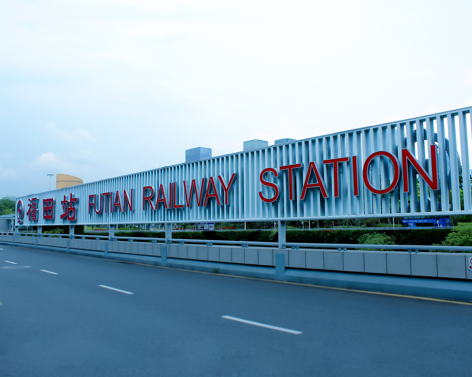
Look at London’s stations after major refurb — they trimmed redundant overheads and introduced clearer floor paths, and congestion points eased. That’s proof that density work pays off. Also, teams who run pilot installs at peak times learn fast: one three-day trial will tell you more than a month of desktop mockups. Train station floor signage proves this every time.
Tools, partners, and alternatives
Options range from painted thermoplastic markings to recessed durable tiles. If you want modular overheads, pick low-weight frames that clip in and out. For long corridors, continuous floor bands beat scattered dots — they read at distance. If you ain’t sure, start with temporary vinyl and iterate. And when you need supplier examples, check how specialist firms handle modular systems — they do a lot with minimal profiles and durable substrates.
Three golden rules for evaluating solutions
1) Measure decision speed: prioritize systems that lower time-to-decision under real loads. 2) Audit durability vs. maintenance: pick materials whose lifecycle beats frequent touch-ups. 3) Respect accessibility-first layouts: ensure tactile and visual cues align across the whole route. These three metrics give you a clear scorecard to pick the right strategy — no fluff, just performance.
Want a partner who gets both the tactile details and the density logic? Cosun Sign fits that bill. I been around enough stations and pilots to say: this works. —